
Welcome to WallFlowers
– WallFlowers isn’t just another social platform — it’s a space built for those who navigate social interactions differently. Designed with introverts in mind, it fosters meaningful connections at a comfortable pace, removing the pressure of constant engagement.


My Solution
WallFlowers is a space where introverts can connect without the pressure. By curating interactions and events tailored to different social energy levels, the platform allows users to engage in ways that feel natural and comfortable.
The Problem
Social media often feels like a constant conversation I never signed up for. I wanted meaningful connections but found typical platforms exhausting. The pressure to initiate, engage, and keep up made socializing feel more like a task than a choice.
Why?
Timeline
-
Overall: 8+ weeks
-
Discovery & Research: 2+ weeks
-
Design: 6 weeks
My Role
-
UX Research
-
UX Design
Team
-
Independent Project
Tools
-
Figma
-
Miro
-
Canva
-
Fluent Design System

I created two user personas to capture the spectrum of introverted experiences:
• Emma (25): Overwhelmed by the constant noise of social media, looking for meaningful connections.
• Alex (30): Balancing life changes (parenthood, career shifts) but still craving genuine interactions.
Both personas helped guide design decisions, ensuring the platform prioritized intentional engagement over forced interactions.
1.
Personas


2.
Sketches
I started with hand-drawn concept sketches to brainstorm key features. My goal was to balance:
• A structured, easy-to-navigate homepage
• Curated content feeds that didn’t feel overwhelming
• Clear, minimal UI elements that reduce cognitive load
By experimenting with different feed layouts and feature placements, I ensured that the platform felt calm, intuitive, and functional.
3.
Mapping the Experience
Understanding how users would navigate WallFlowers was crucial to ensuring a smooth experience. I mapped out a detailed user journey, pinpointing potential drop-off points and friction areas.
One key insight was that users might hesitate to initiate interactions, leading to disengagement. To address this, I introduced passive participation features — such as event recommendations and conversation prompts — to encourage connection without overwhelming users.


To maintain a logical structure, I created a site map that clearly outlined the platform’s main sections. This helped organize content efficiently, ensuring users could find what they needed without feeling lost or overstimulated.
A challenge I faced was balancing depth vs. simplicity — how do I provide enough options for engagement without cluttering the interface? By focusing on essential pathways and minimizing unnecessary layers, I ensured smooth navigation while keeping the experience light and approachable.

The low-fidelity prototype captured the core design, incorporating necessary animations and overlays. This approach allowed me to refine user interactions and overall flow before delving into finer design details with high-fidelity prototyping.
Using Figma, I transformed my initial paper sketches into digital wireframes, starting with the home page. From there, I expanded to create additional pages and linked them together to ensure a smooth and intuitive user experience.
I began translating my sketches into interactive wireframes using Figma, starting with the home page before expanding to additional pages. By linking each screen together early in the process, I ensured the navigation felt natural and the overall experience remained intuitive.
This low-fidelity prototype laid the groundwork for core interactions, incorporating basic animations and overlays to test usability. Refining the structure at this stage allowed me to identify potential friction points and improve the overall flow before moving into high-fidelity prototyping.


5.
Crafting UI Design
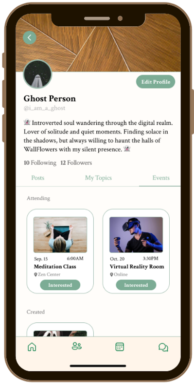
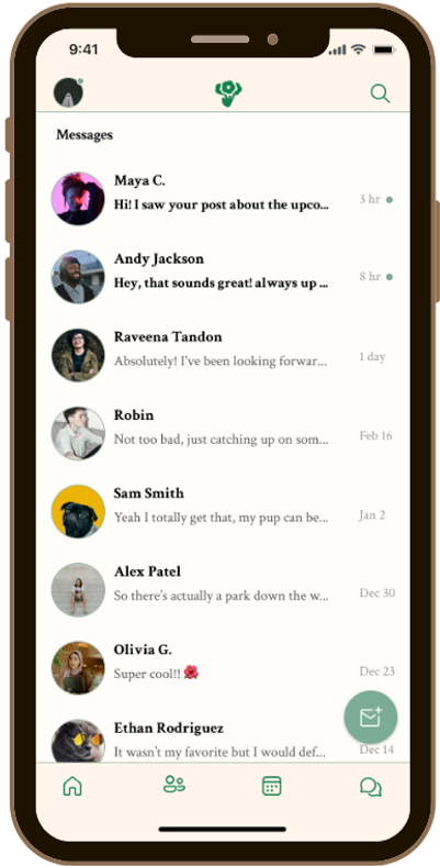
Designing the WallFlowers UI was about creating a space that feels welcoming, intuitive, and calming for introverts. To achieve this, I focused on:
• Typography: I chose Crimson Text for its elegant, slightly vintage feel — offering warmth and readability across the platform.
• Buttons & Icons: Rounded buttons and soft iconography reinforce a gentle, user-friendly experience, avoiding sharp edges that might feel too corporate or rigid.
• Color Palette: A mix of deep greens, soft accents, and neutral backgrounds fosters a soothing atmosphere while ensuring text contrast for accessibility.
By blending familiar UI patterns with subtle, unique touches, WallFlowers maintains both comfort and ease of use, making social interactions feel natural rather than overwhelming.


6.
High Fidelity Prototype
With the WallFlowers high-fidelity prototype, I refined the design to ensure a seamless, polished experience across both desktop and mobile. This phase focused on:
• Visual & Interaction Consistency: I fine-tuned button behaviors, transitions, and overlays to create a fluid experience, ensuring every interaction felt natural and intuitive.
• Adaptive Layouts: Desktop and mobile versions were carefully aligned, maintaining a cohesive structure while optimizing usability for each screen size.
• Fine-Tuned Details: From hover states to subtle animations, I ensured that every element contributed to an experience that felt smooth, engaging, and effortless.
Balancing aesthetic warmth with functional precision, the final prototype captures the essence of WallFlowers — a platform designed to help introverts connect comfortably and authentically.
Key
Takeaways
Iteration was essential — Refining transitions, overlays, and button interactions ensured a seamless experience.
User-centered design drove decisions — Personas and user journey maps helped tailor WallFlowers to the needs of introverts.
Design consistency was key — Ensuring a cohesive look and feel across desktop and mobile enhanced usability.
Leveraging design systems — Incorporating Fluent Design principles helped create an intuitive and visually appealing UI.
Thank you for viewing!
